
A new look- same old me!
Portugal often reminds me of myself- a little battered by time
Yet still hopeful of a bright tomorrow.
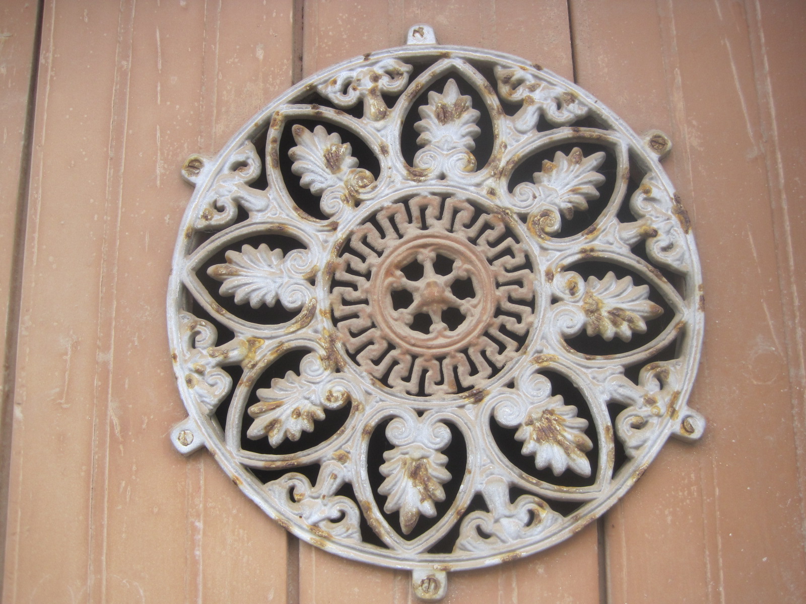
A little quirky sometimes…
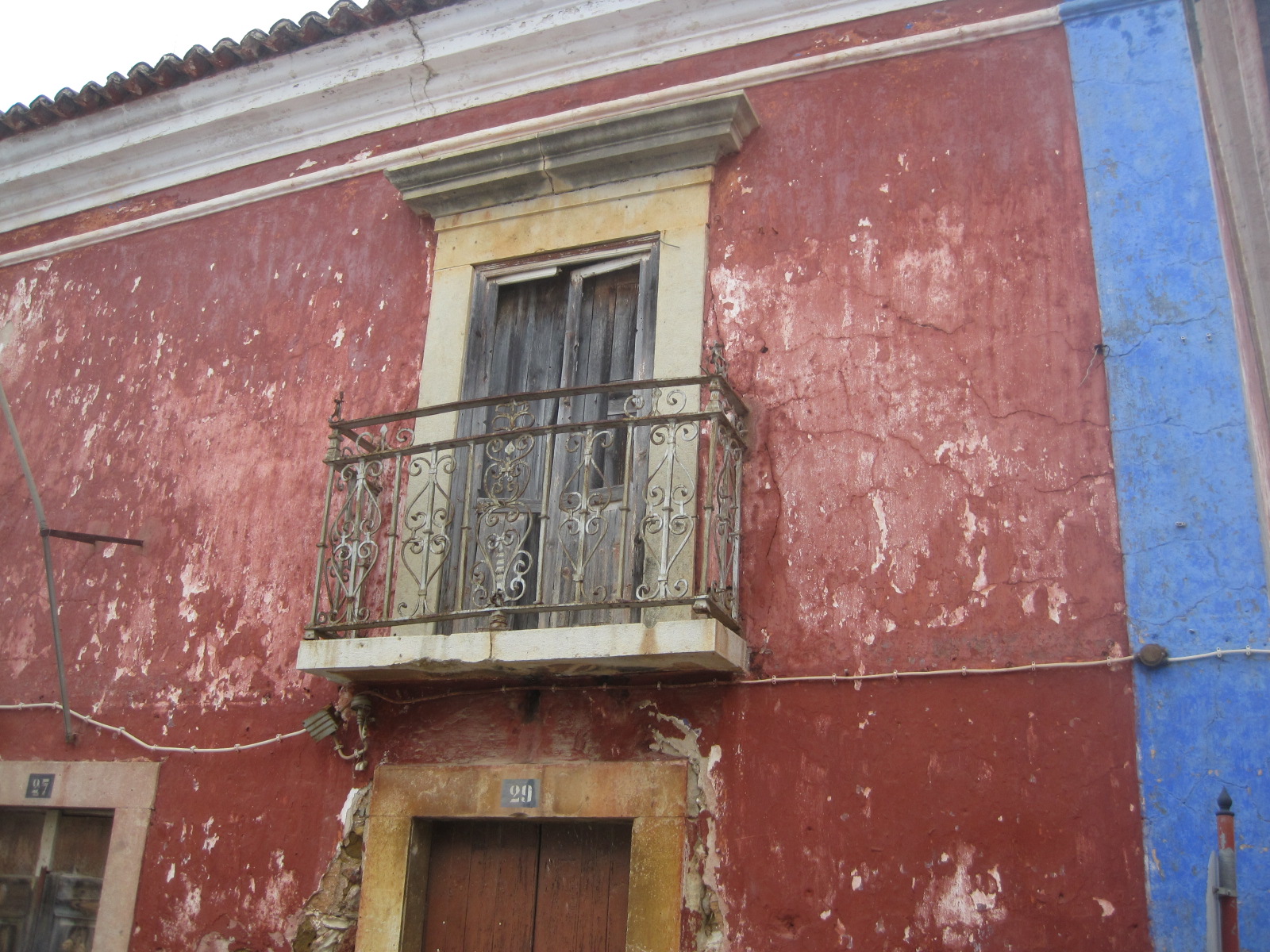
And often down-at-heel!
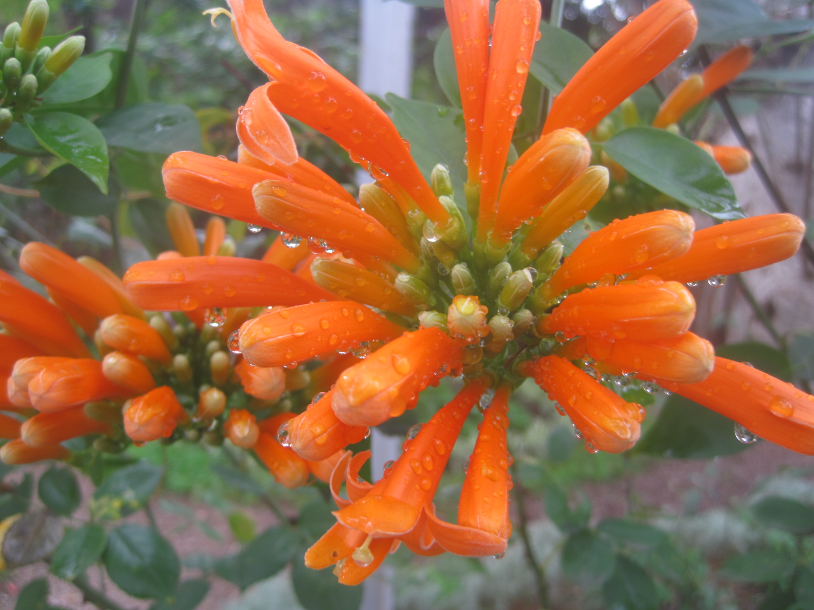
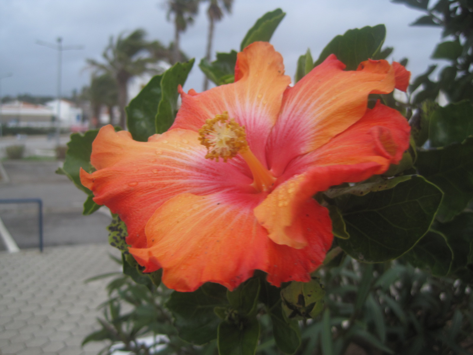
Just occasionally full of dewy promise
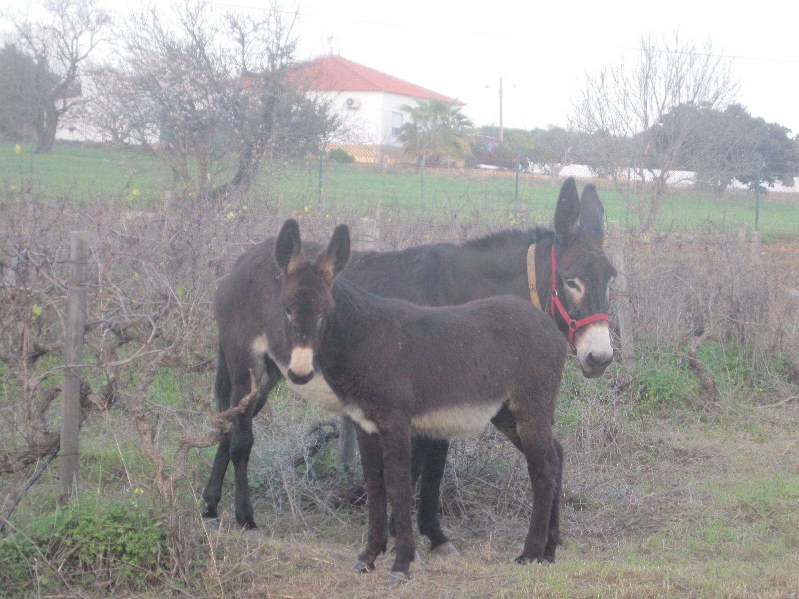
But more often, stubborn as a mule!
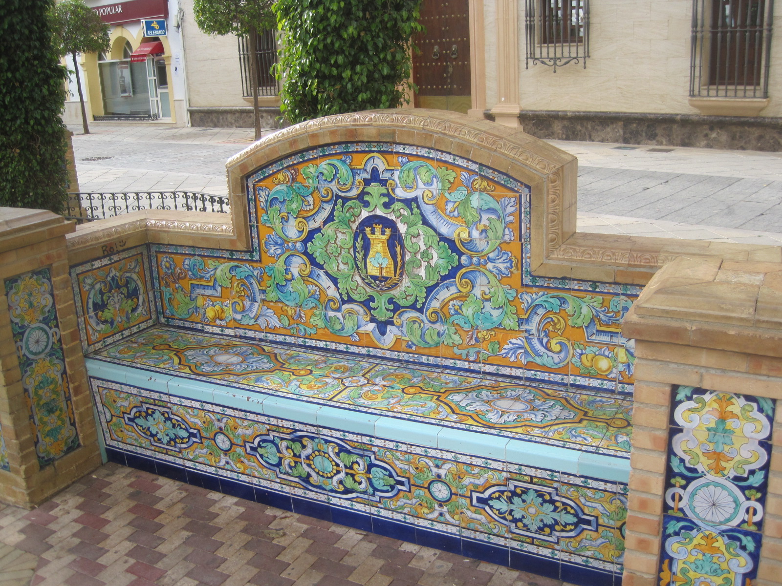
Always happy to find a nice bench to watch the world from
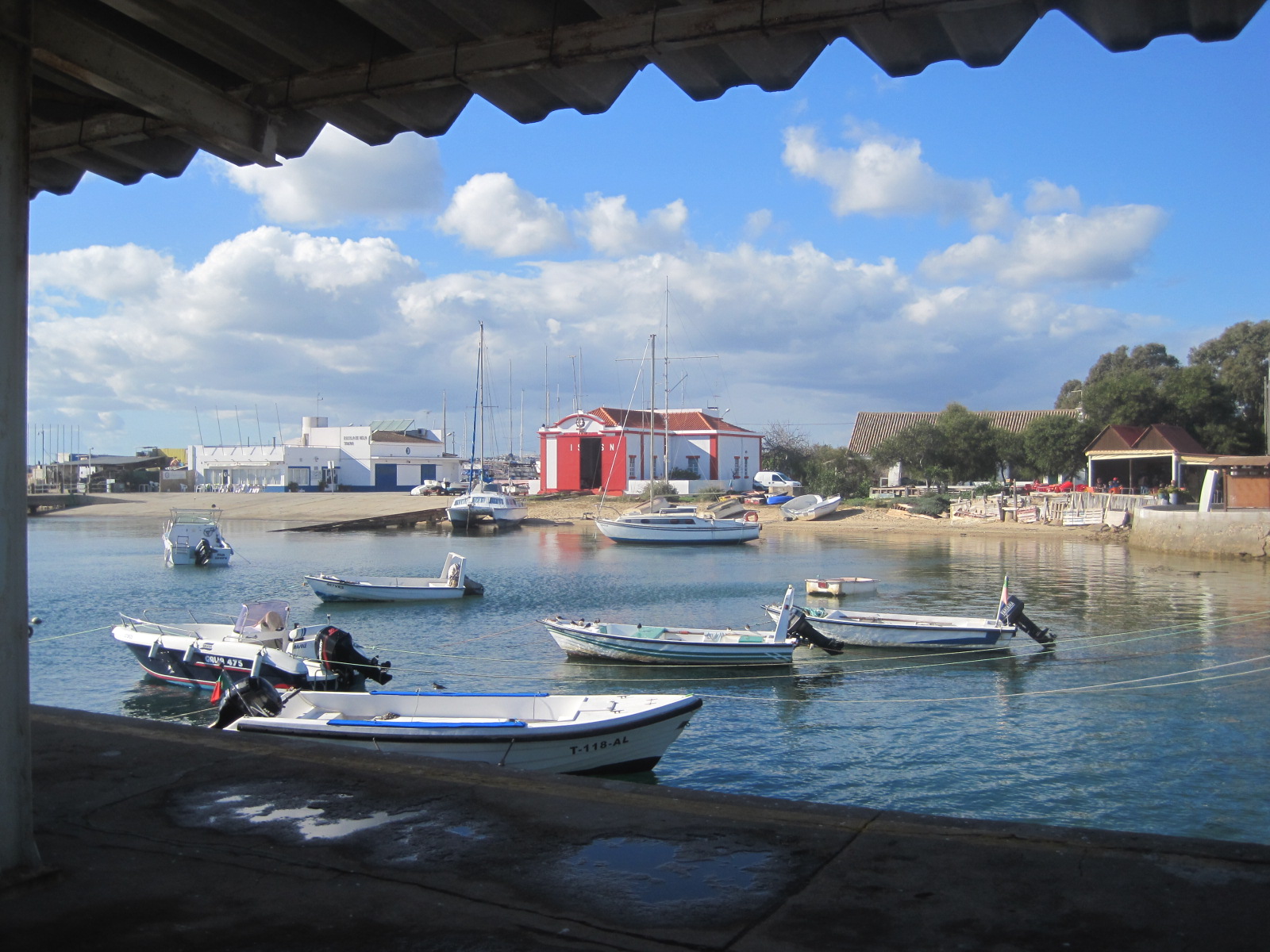
Or even better, a couple of boats, drifting on the water
This is my new look. I wanted something a little “cleaner” and less cluttered, but I’m not entirely happy with it. I still hanker after “the old look” and my nice header photo. What do you think? It definitely needs a bit of work, and I might well revert to type. That’s me all over!
Meantime, don’t forget it’s Saturday. Have you got six words you want to share? Cate at Show My Face will be happy to receive them. Just click on the link or the header to join in.


I like the new look! Always love the same beautiful you, Jo!
Btw, did you enjoy the Australian women’s final? Men’s final tonight 🙂
LikeLike
I had a crazy busy couple of days, Amy, and didn’t see the Ladies, but I’m just about to put the laptop off to watch Rafa and Stan. It should be a good one. 🙂 Thanks for your thoughts.
LikeLike
I say play till you find just the right one to make your posts POP!
LikeLike
Thanks, Eunice 🙂 Good advice, as always! Take care of yourself.
LikeLike
Will do!
LikeLike
Hi Jo! I like the new and clean look, but I think I would prefer one of your beautiful window photos in the header, if you’re able to do that. If not, I say put the mules up there…I love mules and I love that photo, they both look a little shy. 🙂
LikeLike
Thanks, Jill. That’s what I wanted to do, but don’t think it’s possible. The jury’s still out for me but I’ve had some good suggestions. Watching Rafa this morning, then I’ll have another think and a play 🙂
LikeLike
Hi Jo, I usually only read blogs on my iPhone so can’t comment about how yours looks on a computer screen, but on a phone it looks like it needs that header photo back!
LikeLike
That’s a good point, Rich! Good times in Bruges 🙂
LikeLike
I like the clean look of the new look, but I miss the old header photo. Today’s photos are lovely, in particular the colours of the flowers – perfect for a dull January day. 🙂
LikeLike
Thanks a lot, Elaine. I feel much the same 🙂
LikeLike
I like your new look, Jo, mainly because that dark header is very dramatic and your pictures seem larger (doing them more justice). I think you might even be able to make them a little larger still by changing the setting when you add the pic to the blog from the media library. I think it would be even better if the pics went to the edge of each margin of text.
I experimented with all these new themes, including Suits, when they came out last week because I keep thinking I want to change mine, but I always lean towards the ones that allow me to put a header photo. I don’t know why, because these clean looks are very nice!
I like the photo depiction of your personality, Jo, but I would say I like the quirky one best! I’d definitely add your sense of humor! 🙂 xxx
LikeLike
That’s interesting, Cathy. Thanks for your thoughts. Bigger photos was what I wanted but not really at the cost of the header photo. I liked “Spun” because it seems to deliver that and the look is a little different, but the blog name fades and the “roaming at home and abroad” tagline isn’t even visible with Spun. I’m not clever enough to do much else but I’ve had a few suggestions from kind folks, so I’ll be playing some more (after I’ve watched Rafa 🙂 ) Love ya, honey!
LikeLike
Beautiful photographs, I loved them dear Johanna, Thank you, love, nia
LikeLike
Thanks, Nia. You’re a sweetheart. 🙂
LikeLike
I have thought of changing my look after 2 years however I always chicken out. Nice job!
LikeLike
Thanks, Judy. That’s appreciated. 🙂
LikeLike
I loved your old look, Jo, but whatever rocks your boat is fine by me. That down at heel building has so much charm, and is also very photogenic. 🙂
LikeLike
Unlike me 🙂 Thanks, Ad. I’ve been threatening to do this for ages, and now that I’ve started I’m still not sure. Never mind- so long as the content’s ok, huh?
LikeLike
Absolutely, and it always is. 🙂 I’m still hankering after my old hammock and the mountain. 😕
LikeLike
I thought that too, Ad. It was so much “you”. 🙂
LikeLike
I like the new look Jo although I was rather partial to your header picture from before… 🙂
LikeLike
Me too, Suze. The jury’s still out 🙂
LikeLike
Hi Jo, I’m a bit behind on catching up, sorry about that, still haven’t read your other Castro Marim post which I am looking forward to.
Anyway, as ever working backwards so starting with this because I can’t resisting commenting on blog design, well some. I like the clean look.
When I changed my blogger blogs before I moved to WP, I never altered them after that. I liked the black and white, I probably still like those headers better than my WP ones because you get greater photo depth.
http://itchyfeetatforty.blogspot.com/
and
http://pippadogblog.blogspot.com/
I can’t remember your previous theme/image of course, but I do remember it was softer and maybe blue?
I think because your blog is very photo-orientated you might want to put a header pic in – can you do that with this theme? The current one is very hard news orientated (I know I’ve got my journo hat on), so unless you beef up the photos, give them frames whatever, you might want to look at softening it somehow. The best photo that works with the new theme is the bottom one because of the dark frame within the photo, ie the roof and the pavement. That and the bench, incidentally are my fave pix, I so remember those benches from Olhao.
Anyway, I do like the new look, it’s not dissimilar to my 2011 theme, just that I use a header photo, I really really like that feature.
I saw someone else’s blog that looked great, similar, clean, different theme – tried it on mine – rubbish! Maybe you should have done a screen shot of the old one and a poll?
I wrote a recent post about style and appearance (and a load of other basics) so to save me repeating all that:
http://wp.me/p22GQH-sv
LikeLike
Thanks for the detail, Rough. I’ll look at that last post later. I did want a photo header, but more than that I wanted my photos to appear bigger and bolder. I also wanted to retain the “roaming at home and abroad” bit of my tagline and some of the themes omit that, or the blog name doesn’t stand out enough. Easier sometimes to see what you don’t like than find what you do. This is just a start point with me. (the old header was the town wall on the Headland in Hartelpool)
LikeLike
If you are going for photo presentation then there are always the black background themes, which are ok, but …. if you write text as well, it can be quite jarring. Vicky used Nishita I think initially, but now is using My Life (I think that’s the name).
I use quintus (I think!) on Pippa’s WP blog, and I think the photos look ok. I think one other thing to consider is background colour, so that when you do a caption, the photo automatically looks framed, that just makes the pix stand out that little bit more.
I’ve not tried Suits or whatever it is, so might have a tinker tomorrow. Bedtime now though.
LikeLike
I like the new look Jo. Maybe some color in the header other than black? The new look really helps your photos pop I think. Just my thought. Are you really stubborn as a mule?
LikeLike
Yes, so that header will be staying black, Sue 🙂
LikeLike
Haha well there you go! 🙂
LikeLike
My idea of a joke, Sue 🙂 It’s a thought. Not sure if I can insert a photo- I did this rather randomly)
LikeLike
Although it took me a few seconds I got the joke Jo. 🙂 trust me I’ve been called a mule myself…well perhaps another word was used.
LikeLike
Phew, and there was me thinking I might’ve crossed another friend off the list 🙂
LikeLike
Wuirky Jo: the new look is great. I like the clean design. As for the photos: spot on, as usual.
LikeLike
Thanks, Viv 🙂 Glad you approve.
LikeLike
Go Girl! Have a play with the themes, it costs nothing, I agree with FaF, maybe you need a more funky one – have you tried the 2013?
LikeLike
I tried quite a few- not sure if I tried that one, Jude. I wanted one with a header photo, but I could have just kept the old theme and changed the photo, couldn’t I? Seemed a bit of a cop out. I intended to split the blog into Home and Away sections, but I couldn’t get my head around it. Must be easier to start from scratch? Thanks for the encouragement. 🙂
LikeLike
Do you use menus? They help to split up your site – that’s how I have managed to incorporate three of my blogs into one. So Postcards and Urbanicity are now on the main menu, with Travel Words posts under On the Road. I did have to catorgorize my posts, but it wasn’t too difficult to do.
LikeLike
I noticed the option to use them, but wasn’t sure how that would look. I’ll have to read up on them. I started my Pages as a way of keeping the A-Z’s separate, but it becomes very labour intensive keeping everything up to date. I need to do some blog admin while the days are still grey. 🙂
LikeLike
Well, according to this, you are a very well rounded individual.
The new theme? It’s very nice. Yes, clean. If that’s what you’re going for, you have it, girl! But I like the option to insert headers, and you are so upbeat and fascinating. I’d like a little more spunk, to match you. But that’s just my two cents.
LikeLike
I like your thinking! 🙂 I’m not too sure what options I have with this, Gem. Need to mess about a bit. I liked the theme “Spun” which is all little circular photos leading to a post, but it looked a bit “wishy-washy” in practise. This was done on a whim and I might well retreat into my friendly town wall header.
LikeLike
Wishy-washy is definitely not you! Flash and style. Now you find a theme like that and you’ve got it made!
LikeLike
Beautiful photos ! I like the design of the plaque, and miss seeing blossoms.Wow the bench is beautiful. I like the way you describe yourself.
LikeLike
Weathered, I think would describe it well, Divya 🙂 Many thanks!
LikeLike
I do like the new look, definitely clean and not so cluttered. Your pictures and captures are really good.
LikeLike
Thanks, Ute 🙂 I often think I should go down the photo processing route but I’d never know when to stop. My blog would grind to a halt, so you just have to accept me as I am.
LikeLike
Love you as you are Jo! ♥
LikeLike
Thank you for that 🙂
LikeLike
I like your new look–and I LOVE that bench! Simply beautiful–but maybe not so comfortable to sit upon?
LikeLike
Thank you 🙂 No cushions in sight, either!
LikeLike
What a lovely introduction to new but same Jo 🙂 I know what you mean about changing looks … I don’t know how many times I’ve tried something different playing about with new themes … and then thought * pfft … I’ll stick Lol
Having a great weekend I hope !
LikeLike
Thanks, Poppy. I started out meaning to split the blog into proper home and abroad sections, but as you can see, that didn’t happen. I need to spend some time with it… soon 🙂
LikeLike
Instead of creating pages Jo for Home / Abroad etc. use categories on the menu – new posts with the correct category will then automatically appear when the menu topic is selected (saves having to add posts links manually to a page) More here: http://en.support.wordpress.com/menus/
If you click on any of my menus you will see what I mean 🙂
LikeLike
I’ve got Categories, Jude, but they’re ‘orribly mixed up and ineffective. I posted today, using borders, and have spent the afternoon working on my pages. Very few people visit the pages though, so I’m realising I need to sort my Categories. Thanks so much for your help. 🙂
LikeLike
You’re welcome. Ask if you have any questions about menus and categories, I think the help is pretty good at explaining how it works and once you have sorted your posts they work very well.
LikeLike
Thanks, hon. I’m on a mission 🙂
LikeLike
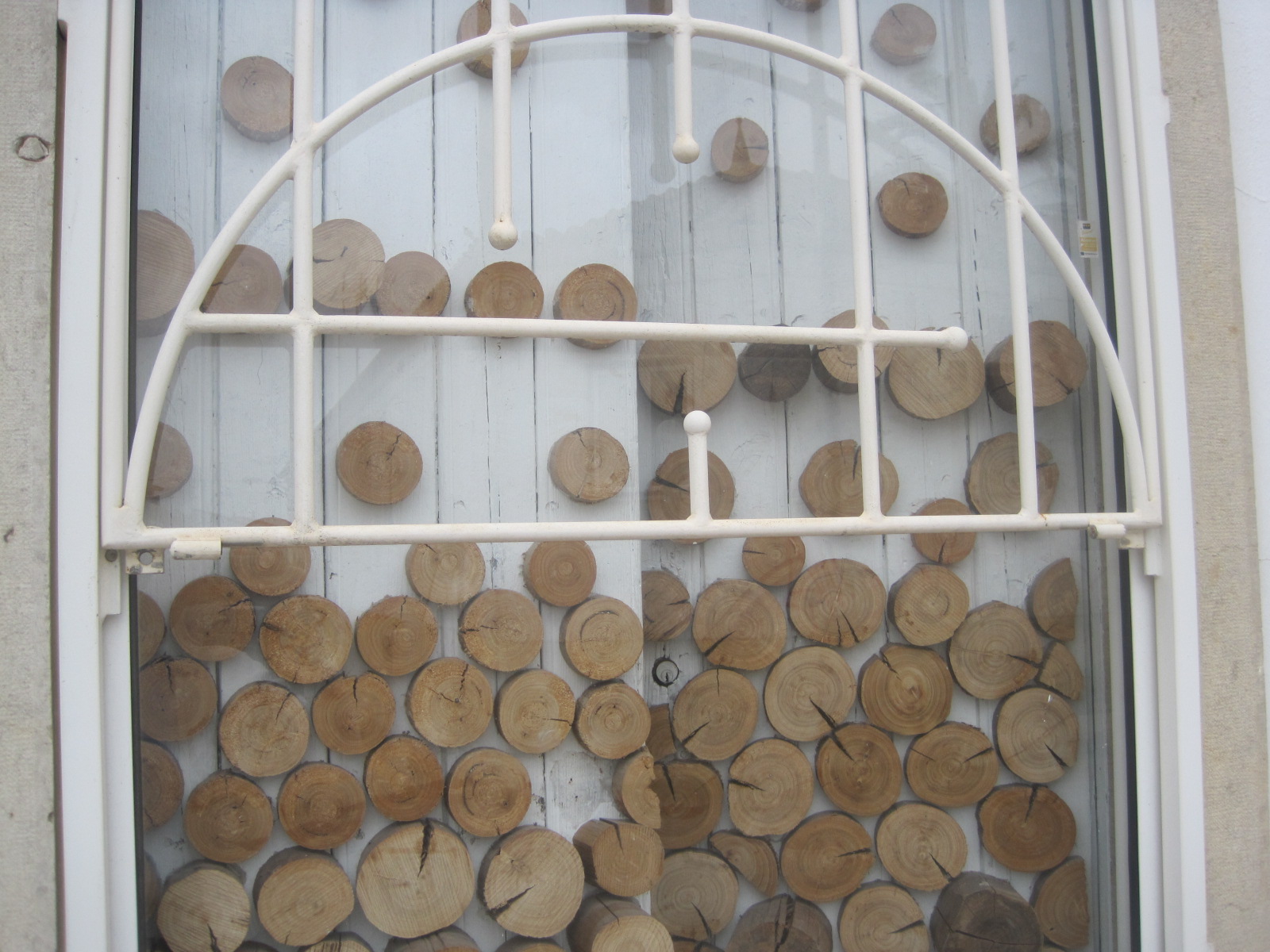
I love you clean look and the same old you! …. the flower with all the waterdrops … beautiful. And I like the window very much …. I wonder what is there behind it.
LikeLike
It was a strange window, Vivi. No real clues about what’s behind. It was just part of a traditional Algarve style house. I walked backwards and forwards a few times taking shots. Curiouser and curiouser (also like me 🙂 ) Thanks, hon. Hope you have a much better week.
LikeLike