Today I thought I’d show you a slightly different aspect of Tavira. The Rio Séqua rises in the hills of the Serra de Caldeiráo and flows down into Tavira. For no very obvious reason when it reaches the bridge, Ponte Romana, it changes its name to become Rio Giláo.
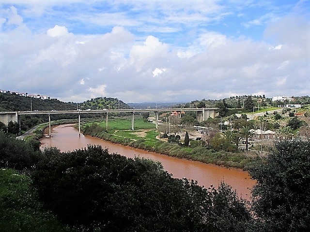
The above photo was taken after heavy rain which brings the bright orange soil tumbling down with it. A road bridge carries the E125 over the river and around the city and a railway bridge does the same for trains.
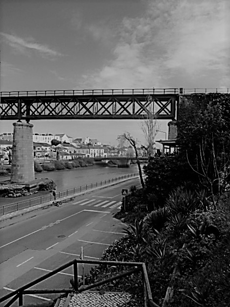
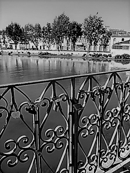
Beyond the railway bridge the river flows beneath a low level blue bridge and into the heart of the city, where it meets Ponte Romana, with its hearts and love locks. Mysteriously becoming Rio Gilao, it then flows towards the former Military Bridge, completely renewed but not yet open.
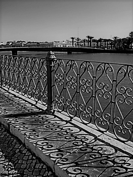
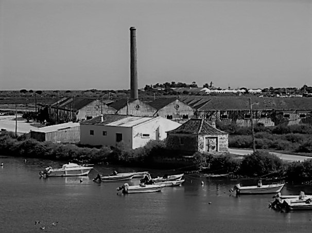
The river starts to widen and flows on, beneath the high level road bridge. and out through the salt marshes, leaving the city behind.

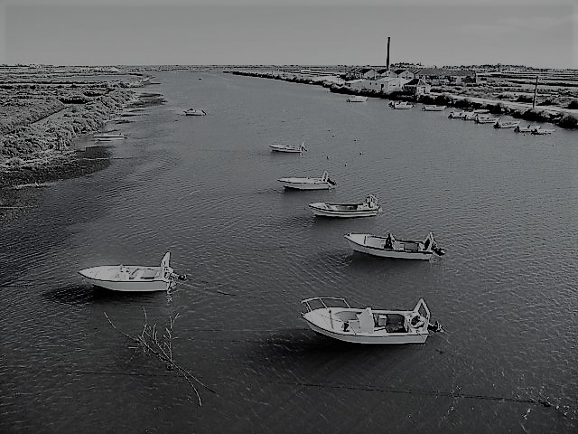
In the normal course of things you can catch a ferry to follow the river on its journey to the sea, or you can walk the road beside it, through the salt pans and out to Quatro Aguas. I’m really missing being able to do this but, hopefully, after Easter.
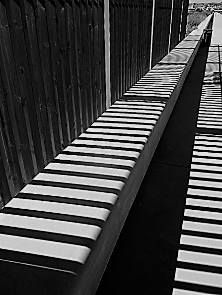
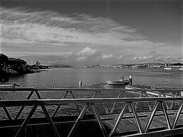
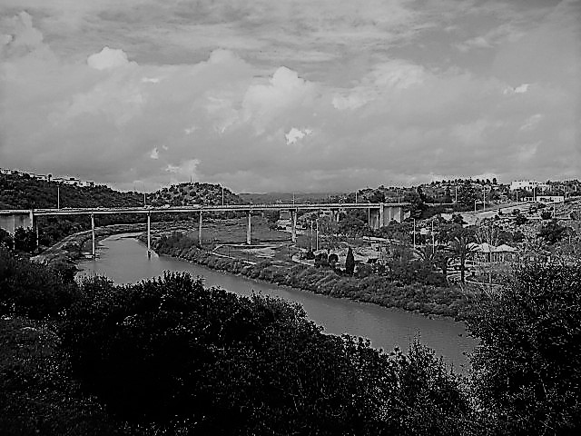
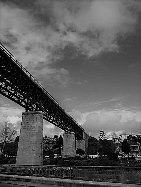
Two rivers, six bridges and a ferry later you will find yourself on the Ilha, looking back at lovely Tavira. I always prefer to share the colour and beauty of this place, but sometimes I can be persuaded to see life in black and white. I think that the bridges make good subjects for this, with their strong lines and the deep shadows cast by the sun.
Terri at Second Wind Leisure Perspectives prompted me to share a black and white view of my world. I simply converted my images from colour. What do you think?

There’s a certain moodiness to B&W photos and they really tell a story. Must admit though that I do love the coloured ones more. Hope you’re well Jo and you get to travel after Easter. xx
LikeLiked by 2 people
Thanks, sweetheart 🙂 🙂
LikeLiked by 3 people
Great stuff.
LikeLiked by 2 people
Thank you! Just found this comment 🙂 🙂
LikeLiked by 1 person
Jo, what a huge difference between the two. In black and white you do not catch the extreme muddiness of the river or the clear blue of the second river. I’m so glad that you used the new block that gives us a comparison. Isn’t that the best new block ever? I agree 100% about the bridges doing well in black and white, though. The iron work is especially gorgeous in black and white, but so are the straight-line shadows. Lovely story. I hope you get back there soon. Our sun is shining beautifully and the temperature is up to 60+ degrees, which is temperate, but the wind still thinks it’s winter. 🙂
LikeLiked by 1 person
We had a cooling breeze here too yesterday, but the Algarve is known for that. It’s what makes our hot summers tolerable…usually 🙂 🙂 Thanks for your company, hon!
LikeLike
It is truly beautiful!
LikeLiked by 1 person
It’s a lovely area, Vivi. I’m very lucky 🙂 🙂
LikeLiked by 1 person
I think black and white works very well for the bridge photos, but for your second image compare shot I prefer the colour version as the river waters are so beautiful!
LikeLiked by 1 person
They are striking when the river runs orange. Thanks for your company, hon 🤗💕
LikeLike
I wish I go there…
LikeLiked by 1 person
It’s a lovely place 🙂 🙂
LikeLike
I’m always a fan of B&W Jo but in this case I think I prefer your colors. The images with strong geometrics though are excellent in B&W
LikeLiked by 1 person
I like my colours too, Tina, and I also like that you’ve taken the trouble to come here. Thank you! 🙂 🙂
LikeLiked by 1 person
There’s that red water again – I know it can’t very good for those who use the river but it is such an unusual sight.
The blue-green of the water near the salt marshes is very captivating as well.
LikeLiked by 1 person
I love the views from up above the river, in both directions, Ju-Lyn. Hills and sea- I love them both 🙂 🙂
LikeLiked by 1 person
They do make for a stunning combination! Your soul must soar everyone you take a walk!
LikeLiked by 2 people
I can’t recall ever hearing about a river with a name change along the way! That’s so interesting to me. And could be a little confusing, perhaps? The black and white are very nice, Jo. You always share the beautiful colors you encounter on your walks both landscape and the colorful cities and architecture, but the bold black and white makes a nice change. Have a wonderful weekend, my friend.
LikeLiked by 1 person
Hi, Debbie 🙂 🙂 I must admit we tend to just think of it as the Giláo, but there is a story behind the river names. Something to do with drowning lovers. The Portuguese like a bit of drama 🙂 Thanks, darlin- you too!
LikeLike
How strange that the river changes names. I do prefer the colour photos, although the black and white look like they were photos from the 50’s.
My daughter owns an investment property in Cabanas de Tavira, but we haven’t been to the area yet. Next time we are in Portugal …
Have a lovely weekend Joanne
LikeLiked by 1 person
Cabanas is a fast growing resort, which has a lot of fans and great access to the beach by a 2 minute ferry ride. We have a few friends there, Sami, and they love it, though it’s a bit commercial for us. It would be good to see your reaction 🙂 🙂 Thanks, darlin!
LikeLiked by 1 person
beautiful, Jo. both color and b/w! love the story! thank you 🙂
LikeLiked by 1 person
Thanks, sweetheart! Have a lovely weekend 🙂 🙂
LikeLiked by 1 person
hahaha I am surrounded by black and white and clouds most days in winter so I love the blue sea and colour of your pics in Portugal.. 😉
LikeLiked by 1 person
It was something I wasn’t sorry to leave behind in the UK either, Lisa 🙂 🙂
LikeLike
I have always loved black and white, so fun to see you show some of your photos in a monochromatic appearance. Otherwise, I always think of Portugal in colours, so always good to break those prejudices.
LikeLiked by 1 person
My processing options are pretty limited, Otto, and don’t always produce the best results but I do like the ‘going back in time’ feel you get with black and white. My world is colourful and I do prefer it that way. Many thanks for your company 🙂 🙂
LikeLiked by 1 person
I think I generally prefer the colour photos, although the close up of the curved railings on the bridge do work really well as blacak and white iamges.
LikeLiked by 1 person
I almost always prefer colour, Emma, but once in a while a change is nice 🤗💕
LikeLiked by 1 person
They do look great in black and white.
LikeLiked by 1 person
Thank you! I like the contrasts 🙂 🙂
LikeLiked by 2 people
Love the story about the river names. Like you, I mostly post color photos, but I think it’s fun and interesting to see what might look good in B&W. As you say, I think the bridge photos work best here with their strong lines and shadows.
LikeLiked by 1 person
One of the things I was happy to leave behind in the UK was a semi-permanent grey world, Graham, so colour is my natural choice. Always good to have a change though 🙂 🙂
LikeLiked by 1 person