
Still playing with moods, and colour
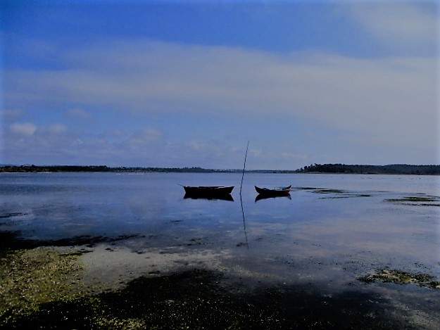
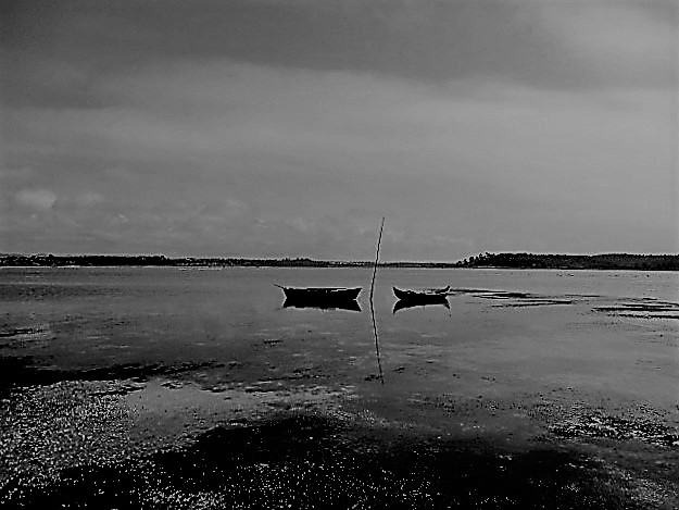
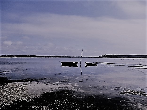
Black and white can look a bit bleak to me, but inject a hint of colour and the mood changes completely, doesn’t it? Brian was a bit naughty with his response to Jude’s 2020 Photo Challenge but I think we might have got away with it. Meantime, strange things are happening on Six Word Saturday. Have a great weekend, everyone!


beautiful image in all colors! happy Sunday, Jo 🙂
LikeLike
It was a beautiful place to be, LolaWi. Wishing you a happy week ahead 🤗💕
LikeLike
I like playing with my camera settings to see what difference they make. My favourite is the third photo. It looks like a painting.
LikeLike
It’s a nice restful one, Carol 🙂 🙂
LikeLiked by 1 person
First one for me all the Way, Jo. It’s a beautiful shot.
janet
LikeLike
Such a serene, lovely place to be, Janet 🙂 🙂
LikeLiked by 1 person
Interesting how the same image delivers a very different mood in each of your versions Jo. Love the original image as well, which gave you a wonderful platform for experimentation.
LikeLike
We were on the home strait and a bit grumpy with each other when we finally found this lagoon, Tina, but it soothed troubled waters 🙂 🙂 Thanks, hon!
LikeLiked by 1 person
Hmm, have fun playing, Jo!
LikeLike
Will do, Sue. Off out to see a jazz combo 🤣💕
LikeLiked by 1 person
Enjoy!
LikeLiked by 1 person
Keep playing Jo. I really like these 😀
LikeLike
Thanks, Cee 🤗💕💕
LikeLike
All three look great, but my preference is the first one.
LikeLike
Mine too, thanks Pit. Have a great weekend! 🤗💕💕
LikeLike
All three look great 🙂
LikeLike
I liked the spot very much, Nikki 🙂 🙂
LikeLike
Beautiful scene, Jo. My preference is the first shot. I wonder whether the boats will kiss at some point, aided by tide, current, or wind…
LikeLike
Just maybe, Liesbet. 🙂 🙂 The tide was pretty high at that point and I’m not sure how much fuller the lagoon gets.
LikeLike
I like the first image.. I’m a softy when it comes to real sea and sky.. 😉
LikeLike
I feel the same, Lisa 🙂 🙂
LikeLike
I prefer a little colour, too, especially with a sea and sky scene. My favourite here is your first image, Jo.
LikeLike
It was a beautiful place to be, Ann, on rather a special day for us. 🙂 🙂
LikeLiked by 1 person
A lovely place to be! I love the hint of colour in the last 😃
LikeLike
Yes, I like that subtle blend too, Rita 🙂 🙂
LikeLiked by 1 person
I agree Jo, color can change the mood. Your images are beautiful. Enjoy your Saturday!
LikeLike
Thanks, Jill. A lovely find and we may return one day 🙂 🙂
LikeLiked by 1 person
As I have repeatedly said this week, black and white photography is not as simple as converting a colour image. You have to have strong contrasts or something with a strong shape. Your sea and sky are much too close in tones and the boats are dark too which is why the colour wins here. Did you see Susurrus’s roses? Their shape comes to the fore in B&W. I like this scene you have chosen, very peaceful. I can imagine sitting and watching this for hours… 😅
LikeLike
Sorry, Jude, on several counts. I forgot to put my link over at yours before I dashed off to t’ai chi this morning, and I admit to not choosing the subject matter well. I’m working from the photos I took in the Alentejo and already had this in mind for today but no caption. It was the loveliest spot, but part of our misadventures- access around a private camp site and a bit gloopy underfoot, whereas if we’d approached from the beach… but lovely and trankwil (sorry, still old laptop 😦 ) with flamingos away in the distance. I am suitably chastised and will come and see Susan’s roses shortly. 😦
LikeLike
No need to apologise Jo. The point is to show that not all coloured images convert well. I always think flowers are better in colour, but Susan proved me wrong.
LikeLiked by 1 person
Lovely shot, looks so peaceful 😍
LikeLike
A really beautiful place, Gilda 🤗💕
LikeLike
I feel that colours are strong mood creators. From black and grey through the whole scale.
That is what painters in all ages used to draw us in.
I love your picture, Jo.
Miriam
LikeLike
Thanks Miriam. It’s a beautiful location 🤗💕
LikeLike
Playing with colours is always fun 🙂
LikeLike
This was a lovely place, Becky, with distant flamingos across the lagoon. 🙂 🙂
LikeLike
perfect 🙂
LikeLiked by 1 person
I like the B/W Jo. It matches the emptiness of the boats.
LikeLike
I think that because I was there and the atmosphere was serene and wonderful I can picture it more readily in colour, Denzil. Hard to be subjective but I think I would still go for the lovely hues in this one. 🙂 🙂
LikeLiked by 1 person
A bit of colour can enhance a mood that’s for sure Jo 🙂 I did get a tisk from Jude though
LikeLike
You did! I can cope 🙂 🙂
LikeLiked by 1 person
Colour all the way for me Jo. While some shots CAN look good in black and white most of them, imo, don’t. The third version looks interesting but the first one is definitely the best 🙂
LikeLike
I like black and white when it’s something aged, Eunice, or to convey a mood, but mostly I’m with you. 🙂 🙂
LikeLike
I think a lot of buildings, especially older ones, look good in black and white but landscapes/seascapes are much better in colour.
LikeLiked by 1 person